
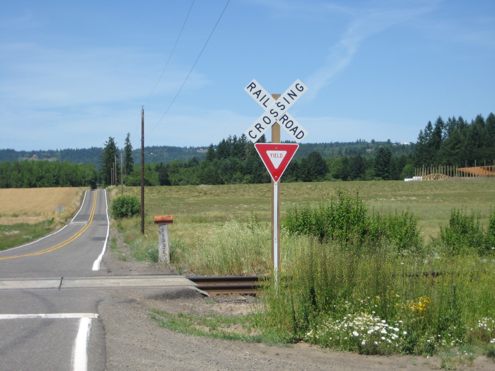
Picture a railroad crossing sign and you’ll probably picture an X — two white boards nailed into a saltire, black letters spelling out RAILROAD on one arm and CROSSING on the other. That sign is real, it’s everywhere, and it is not the sign this story is about.
Table of Contents
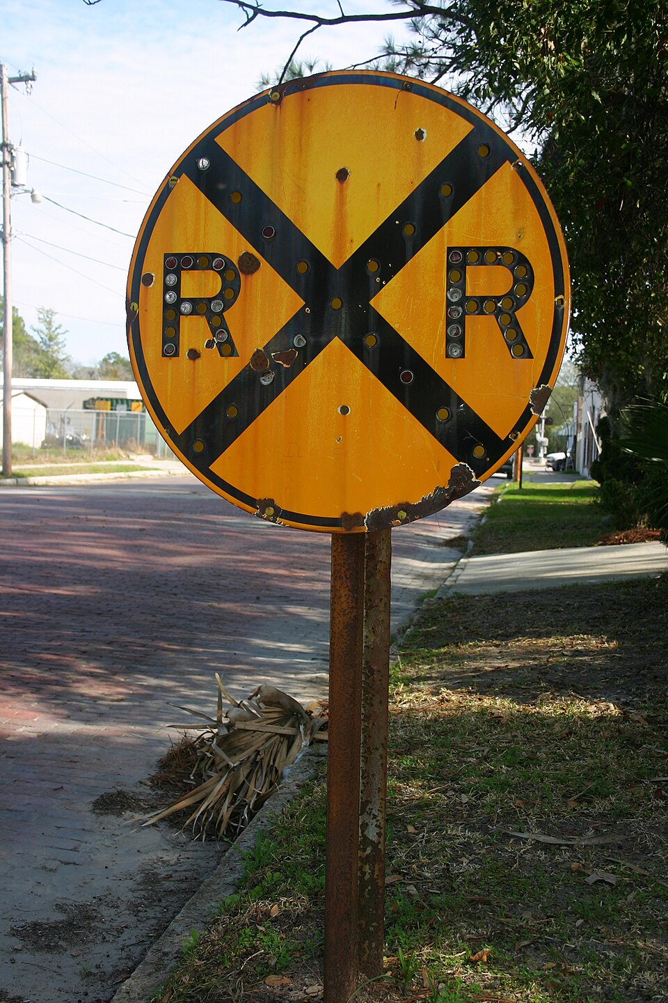
A few hundred feet before you ever reach that X, there’s another sign, and it’s the only one of its kind on American roads: a plain yellow circle. Not a diamond. Not a square. A circle — a shape the U.S. sign system otherwise refuses to use for anything else. That wasn’t an accident of design. It was a decision, made by a committee of state highway officials in the 1920s, who ranked a train ahead of a stop sign on their private scale of how scared a shape should make you.
Quick answer
The round sign — officially the railroad advance warning sign, MUTCD code W10-1 — is round because of a 1920s sign-shape hierarchy adopted by American highway officials, in which a plain circle (treated as having no corners at all, or ‘infinite’ sides) marked the single highest level of danger on the road, outranking even the eight-sided stop sign. Railroad crossings got the circle; stop signs got the octagon.
A country that hadn’t figured out trains yet
In the early 1900s, cars and trains were sharing crossings that had been designed for a world of horses and wagons, and the results were brutal. Railroads had leaned on human crossing watchmen and gate-tenders for decades, but as automobile traffic exploded, that model couldn’t scale. Around 1908, railroads including Union Pacific began experimenting with cheaper, unattended ways to flag a crossing, and over the next couple of decades those experiments converged on a simple wooden X — the crossbuck — after earlier, fussier designs (some tried to sketch the actual layout of the tracks) proved too complicated to read at speed.
The crossbuck’s name is a mashup of ‘cross’ and ‘buck,’ the old carpentry term for a set of crossed timbers, like a sawbuck. It did one job well: mark the exact spot where the rails crossed the road. But a sign planted right at the tracks gives a driver almost no time to react if a train is coming. Highway officials still needed something to catch a driver’s eye earlier — while there was still room to slow down.
The shape that outranked the stop sign
The octagon we now associate with STOP has its own origin story: a Detroit police sergeant named Harold Jackson cut the corners off a square board in 1914, and by 1922 a rural-highway committee working under the American Association of State Highway Officials (AASHO) made the eight-sided shape the national standard for stop signs — specifically so a driver could recognize the command by silhouette alone, from the back, in the dark, or through snow, decades before reflective paint made words easy to read at night.
The following year, in 1923, a regional body called the Mississippi Valley Association of State Highway Departments went further and built out a whole shape vocabulary: the more complicated a shape was to cut, the more danger it was supposed to signal. Rectangles and squares, the easiest shapes, stayed reserved for routine information and regulation. Diamonds marked ordinary hazards — curves, hills, crossroads. Octagons, one notch up, meant stop. And circles, treated as having essentially no corners to count, were kept for the single most dangerous situation state highway officials could think of on an ordinary road: a railroad crossing, where a multi-ton train could not stop for you no matter what you did.
One crossing, two very different signs
That hierarchy got baked into national practice when the first Manual on Uniform Traffic Control Devices (MUTCD) was published in 1935 and adopted, in short order, by most states. By then, American roads commonly carried two distinct railroad signs working together: the X-shaped crossbuck sitting right at the rails, and a separate circular sign — in its earliest form, a disc quartered like a target and stamped ‘RR’ — posted well before the crossing to give drivers advance notice. Nationwide standards for railroad crossing warnings were tightened further by 1949.
That advance sign evolved into the version you’d recognize today: a yellow circle with a black border, a black X through the middle, and the letters R and X and R arranged around it to spell out the crossing at a glance. Exactly how far ahead of the tracks it gets planted isn’t one fixed number — the MUTCD’s own placement table sets the distance using the road’s posted speed and site conditions, so the same sign might sit barely 100 feet out on a slow street in town and 750 feet or more out on a fast rural highway, engineered case by case to leave a driver room to see it, react, and stop well before ever reaching the crossbuck and the rails themselves.
The part most people miss
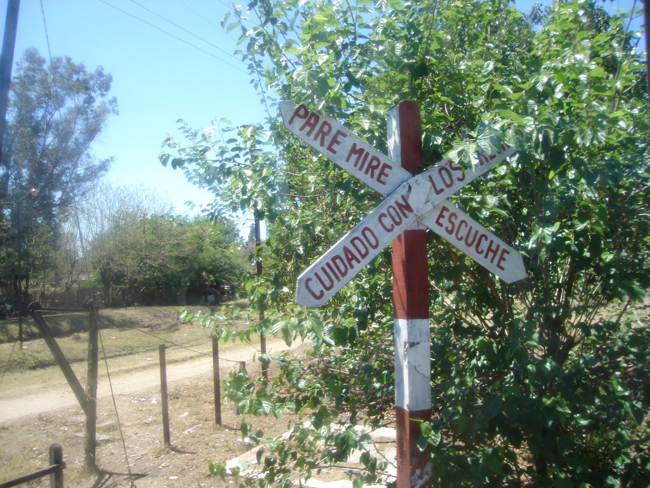
Here’s the twist: ask someone to describe ‘the railroad crossing sign’ and almost everyone describes the crossbuck, because it’s the one planted right where the danger is. But the crossbuck isn’t round — it’s the older, more famous sign that history-of-signs writers rarely have to explain. The circle, the actual answer to ‘why round and not octagon,’ belongs to its quieter, earlier partner down the road, a sign most drivers register subconsciously without ever registering its shape at all. And that’s the point: a plain circle appears nowhere else in the standard American sign vocabulary, so even glimpsed sideways at highway speed, half-obscured by a truck or faded by decades of sun, it can’t be mistaken for a curve warning or a speed limit or anything else. It’s worth noting, too, that the tidy ‘circle equals infinite sides’ logic is how sign historians and traffic-safety writers have reconstructed the committee’s reasoning — the original 1920s meeting minutes naming individual engineers aren’t something readily available in the public record, which is itself a small reminder that even well-documented standards can have folklore stitched into their edges.
Sources
99% Invisible, ‘Red, White & Sometimes Blue: How Safety Shaped the Octagonal Stop Sign,’ on the 1920s sign-shape hierarchy and the reasoning behind circle-for-railroads and octagon-for-stop.
RoadTrafficSigns.com, ‘History of the Railroad Crossbuck Sign,’ on the 1908 origins of railroad crossing warnings, the crossbuck’s evolution, and 1935 MUTCD standardization alongside the early circular ‘RR’ quadrant sign.
Texas Department of Transportation, ‘Warning Sign Advance Placement’ (based on MUTCD Table 2C-4), confirming that W10-1 railroad advance warning sign placement distance is set by posted or 85th-percentile speed rather than a fixed distance, and the Cornell/NYSLTAP guidance on the same table.
Wikipedia, ‘Stop sign’ and ‘Crossbuck’ entries, corroborating the 1914 Detroit origin of the stop sign, its 1922 AASHO octagon standardization, and the crossbuck’s design and naming.
Explore more: more everyday objects with a real backstory.
railroad crossing signs FAQs
What shape is the railroad crossing sign right at the tracks?
That’s the crossbuck — two white boards in an X shape reading RAILROAD and CROSSING. It’s the most recognized railroad sign, but it isn’t the round one.
What is the round railroad sign actually called?
It’s the railroad advance warning sign, designated W10-1 in the Manual on Uniform Traffic Control Devices: a yellow circle with a black X and the letters R, X, and R, posted before a driver reaches the crossing itself.
Why is the stop sign an octagon instead of some other shape?
American highway officials standardized the octagon for stop signs in 1922 so the command could be recognized by outline alone, even in the dark or from behind, before reflective sign paint existed.
Why not just make the railroad sign an octagon like a stop sign?
Under the 1923 shape system adopted by state highway officials, a circle was treated as the highest-alert shape available, ranked above the octagon — and railroad crossings, where a train can’t stop for a car, were judged the higher-danger case.
How far before the tracks is the round warning sign posted?
There’s no single fixed distance. The MUTCD sets placement using a speed-based table, so the sign can sit as close as around 100 feet out on a slow-speed street or 750 feet and beyond on a fast rural highway, engineered to give a driver enough room to see it and stop.
Tales You Can Hold
Fun-facts books for curious kids, personalized books that star your child, and more from the FYI Tales Bookstore. Visit the Bookstore.
Photo: Deloreanman14 at English Wikipedia / Public domain, via Wikimedia Commons.