
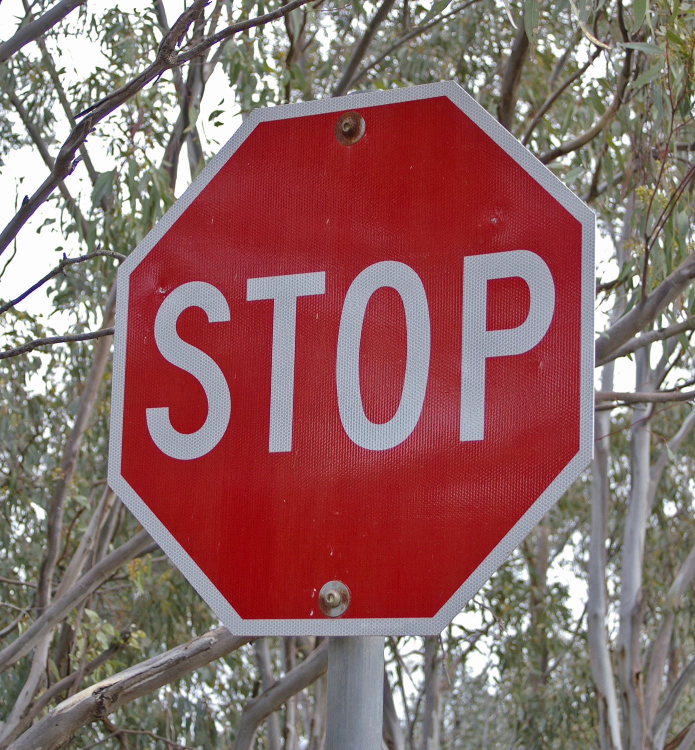
Federal law requires the skinny white border on every stop sign in America to bounce light back at drivers at least five times more intensely than the red field it frames. That rule sits buried in a 300-plus-page rulebook most people will never crack open, and it wasn’t always there — for the first thirty years American stop signs existed, they weren’t even red.
Table of Contents
The full story runs through a 1920s committee that graded road hazards by counting corners, a stubborn chemistry problem that kept stop signs yellow into the Eisenhower administration, and a modern engineering standard that treats that white edge less like trim and more like a headlight-powered beacon.
Quick answer
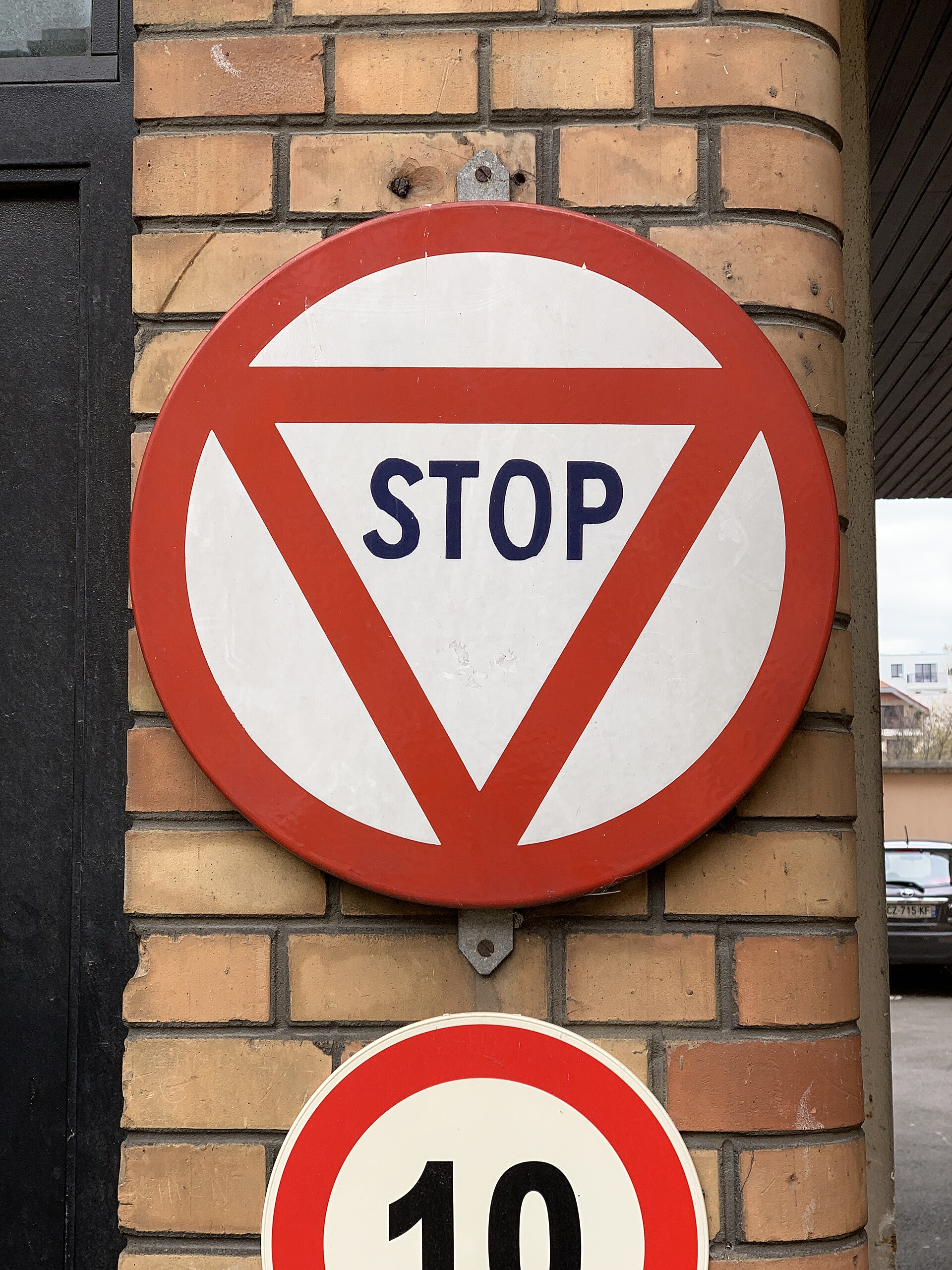
The white border exists to keep a stop sign’s octagon shape readable at night and in bad weather, when a plain red field can fade into shadow or wash out in headlight glare. Under the federal Manual on Uniform Traffic Control Devices (MUTCD), the sign’s white parts must retroreflect light back toward a driver’s headlights considerably more brightly than the red parts — current rules set a minimum 3-to-1 contrast ratio — so the border and lettering do most of the nighttime work while red mainly carries the daytime color message.
A committee that graded danger by counting corners
Stop signs didn’t arrive as a finished product. Early versions in the 1910s were often plain white squares with black lettering, and it took a series of state-highway-official meetings in the early 1920s to standardize anything. In 1922 a small AASHO working group — engineers named John T. Donaghey of Wisconsin, Walter Rosenwald of Minnesota, and A.H. Hinkle of Indiana are credited with the effort — proposed sorting road signs by shape according to how dangerous the hazard was, on the logic that more corners should mean more alarm. Circles, with effectively infinite corners, went to the single most dangerous situation of the era: railroad crossings. The octagon, second-most-alarming shape available, was handed to the mandatory stop.
The Mississippi Valley Association of State Highway Departments formally adopted that octagon in 1923, and the first federal MUTCD folded it into national policy in 1935. But that 1935 manual made the sign yellow, not red — and there was a good reason for the delay in getting to red at all.
When red finally got its due
Red was actually the color highway officials wanted from the start, since it already meant “stop” everywhere else — traffic lights included. The problem was durability: in the 1920s, red pigment faded and chalked in sunlight far faster than yellow did, and a sign that couldn’t hold its color in a field for a few seasons was useless. So in 1924, AASHO settled for yellow, choosing it explicitly because it stayed visible longest, especially at night, not because it matched anything else in the color scheme.
Reflective sheeting entered the picture gradually — the 1935 MUTCD first allowed it, and the 1948 edition made it mandatory — but it wasn’t until fade-resistant retroreflective red sheeting finally became commercially viable that the color switch could happen. The 1954 MUTCD made it official: stop signs became red with white letters, unifying the sign with the red stoplight drivers already associated with stopping. The white border rode in as part of that same 1954 overhaul, not as an afterthought but as the functional partner red needed, because even fade-resistant red sheeting reflects light back far less efficiently than white does.
The part most people miss
Here’s the detail that rarely makes it into the popular version of this story: the white border isn’t just present for contrast, it’s required to outperform the red by a specific, engineered margin. The current MUTCD sets minimum retroreflectivity levels for sign colors, measured in candela per lux per square meter, and for a standard white-on-red sign like STOP, white must hit at least 35 while red only has to clear 7 — with an explicit footnote requiring the white-to-red contrast ratio to be at least 3-to-1. In plain terms, the border and lettering are the parts genuinely built to blaze under headlights at night, punching a bright, unmistakable octagon outline through fog, rain, or unlit country roads, while the red field mostly just needs to register as red once a driver’s eye has already locked onto that white shape. Even the geometry got locked down to the fraction of an inch: today’s standard sign measures 30 inches across, with a ¾-inch white border, so any city or county in the country can order an identical part.
Sources
Wikipedia’s entry on the stop sign, covering the 1922–1954 shape and color timeline.
99% Invisible, “Red, White & Sometimes Blue: How Safety Shaped the Octagonal Stop Sign,” on the Mississippi Valley Association’s shape-by-danger logic and the 1954 color switch.
The Federal Highway Administration’s Manual on Uniform Traffic Control Devices, 11th Edition (2023), Table 2A-5, for the current minimum retroreflectivity and white-to-red contrast ratio requirements.
AAA’s Northeast magazine feature on stop sign history, for the early-1900s and 1920s standardization details.
Explore more: more true stories behind everyday objects.
stop sign FAQs
When did stop signs get their white border?
It arrived with the 1954 federal switch from yellow-and-black to red-and-white. Before that, stop signs used from 1924 to 1954 were plain yellow with black lettering and no white trim.
Why can’t a stop sign just be solid red?
A solid red field can blend into darkness or wash out under headlight glare at night. Federal rules require the white border and lettering to reflect light back much more brightly than the red, so the sign’s octagon shape stays recognizable even in poor visibility.
Is the white border actually more reflective than the red, or does it just look that way?
It’s measurably more reflective by design. The current MUTCD sets a minimum retroreflectivity of 35 candela per lux per square meter for the white portions of a stop sign versus just 7 for the red, with a required contrast ratio of at least 3-to-1.
Why is the stop sign an octagon instead of some other shape?
A 1920s AASHO effort assigned shapes to hazards based on how many corners they had, reasoning that more corners signaled more danger. The octagon went to the mandatory stop as the second-most-serious hazard behind railroad crossings, which got circles.
Tales You Can Hold
Fun-facts books for curious kids, personalized books that star your child, and more from the FYI Tales Bookstore. Visit the Bookstore.
Photo: Bidgee / CC BY 3.0, via Wikimedia Commons.